Design Systems & TV UI Infra
As the TV OS & Experience UX lead, I initiated and led the design and development of a unified design system bringing consistency across teams, features, and products at Google TV.
Executive Summary
Google TV faced significant challenges with UI inconsistency, duplicated engineering effort, and slow development velocity due to fragmented implementations across teams. To address this, I played an instrumental role in initiating and developing TV UI Infra: a unified design system and reusable component library.
This foundational initiative successfully streamlined development workflows, enforced UI consistency, delivered substantial performance improvements (including a 38% faster boot time), and achieved strong adoption, strategically improving Google TV's quality, scalability, and developer efficiency.
The Problem: Scaling Pains & Inconsistency
When Google TV launched, the focus was speed to market. While successful initially, as the platform matured and scaled, significant challenges emerged:
- Inconsistent User Experience — Similar UI components were built independently across different teams (LauncherX, Settings, Assistant, Play Store, partner apps), leading to visual and interaction inconsistencies that eroded user trust and brand coherence.
- Duplicated Effort & Wasted Resources — Teams were constantly reinventing the wheel, wasting valuable engineering time and increasing maintenance overhead.
- Slow Development Velocity — Making global UI changes (like updating themes or components) was arduous and time-consuming. Feature iteration and experimentation were significantly inhibited.
- Lack of Centralization & Documentation — There was no single source of truth for UI components or design guidelines, leading to confusion, difficulty onboarding, and challenges enforcing best practices.
- Performance Bottlenecks — Localized implementations missed opportunities for global performance optimizations (e.g., inconsistent font loading impacting startup times).
- Scaling Issues — The rigid, fragmented UI infrastructure impeded the ability to scale efficiently, support new features, onboard partners, and provide OEM customization templates.
The Solution: TV UI Infra
Streamlined UI development with a set of high-quality reusable, flexible components shared across teams with clear documentation and best practices built in.
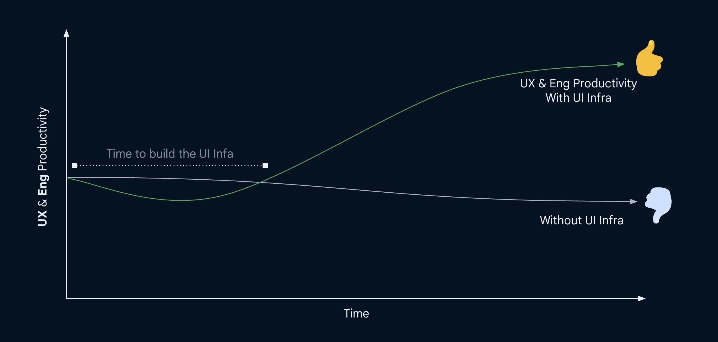 Illustrative UX & Eng productivity graph with UI Infra
The Approach: Building a Foundation for the Future
Recognizing the need for a fundamental shift, we proposed and executed a plan to build a centralized UI infrastructure ("UI Infra").
Vision & Strategy:
- Authored proposals outlining the problems and the vision for a shared component library and design system.
- Advocated for resources, securing leadership buy-in for a dedicated infra team (including Tech Lead, PgM support, Designer time, and contributions from feature teams).
Defining Standards & Requirements:
- Established clear Coding Requirements (no business logic in components, abstraction for logging, documentation standards).
- Defined Documentation Standards (Readme file for each component with screenshots, code samples, owners, and spec links).
- Set Testing Requirements (unit tests, optional Scuba tests) and Integration Guidelines (granular visibility rules).
- Mandated adherence to core Design Values (colors, typography, motion) from the theme, pushing back on non-standard implementations.
Design & Development:
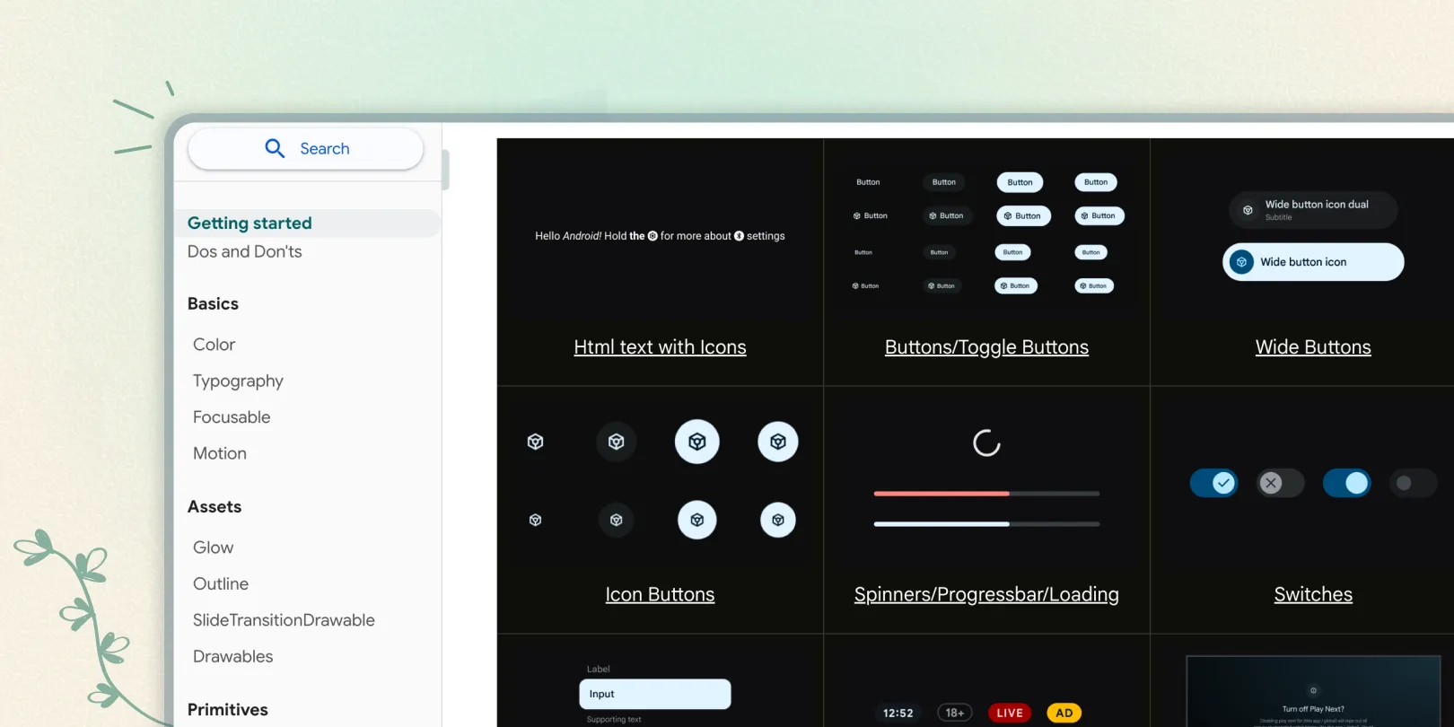
We invested in three major areas: Figma sticker sheets, a developer documentation portal, and a catalog app.
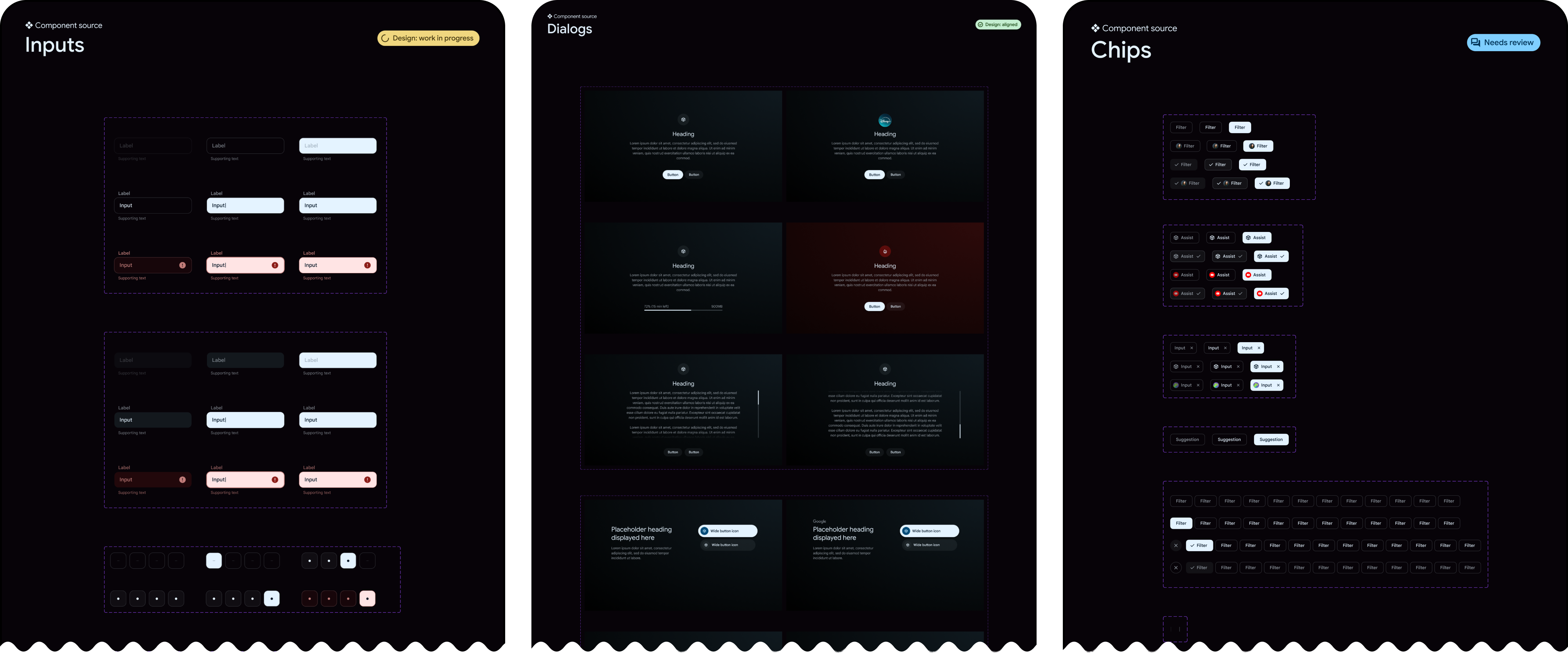
Sticker Sheets & Component Design:
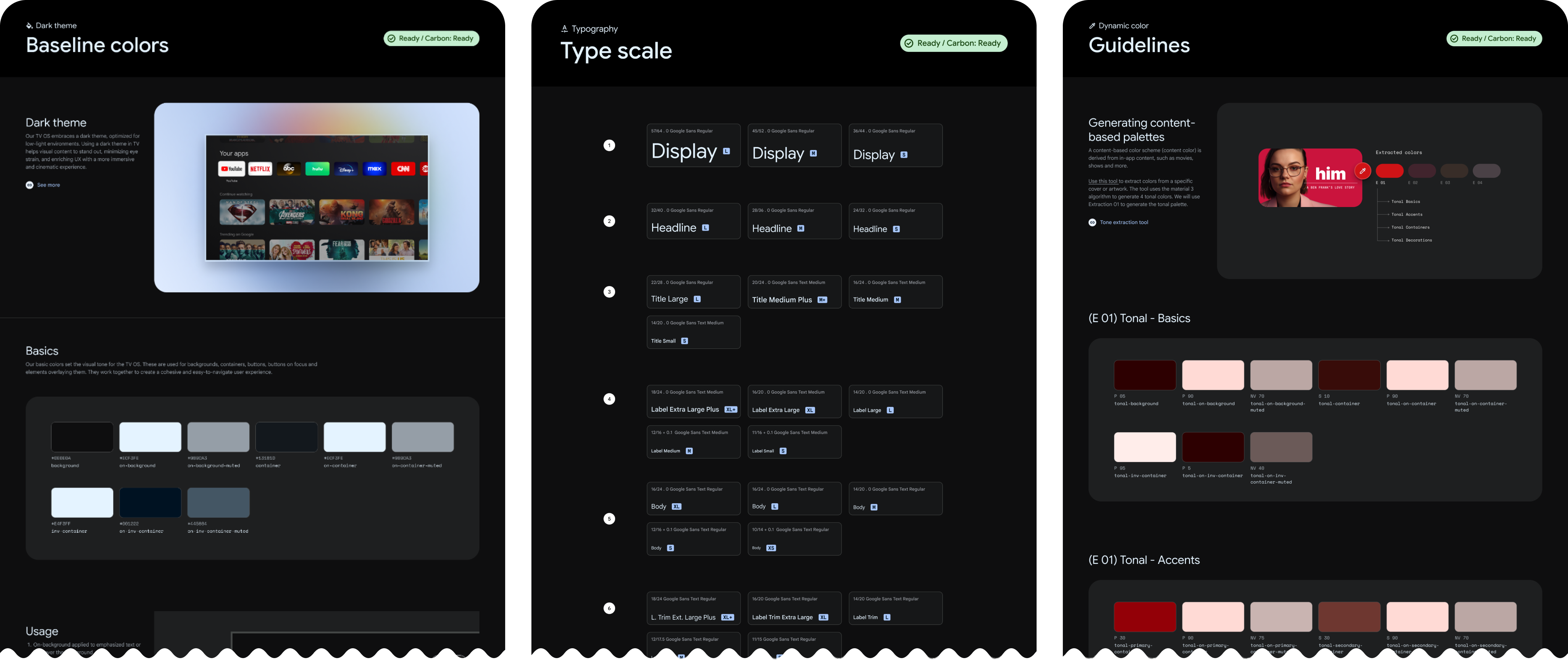
- We began by establishing the foundational design system elements (colors, typography, motion, etc.) aligned with Material Design 3 principles adapted for TV.
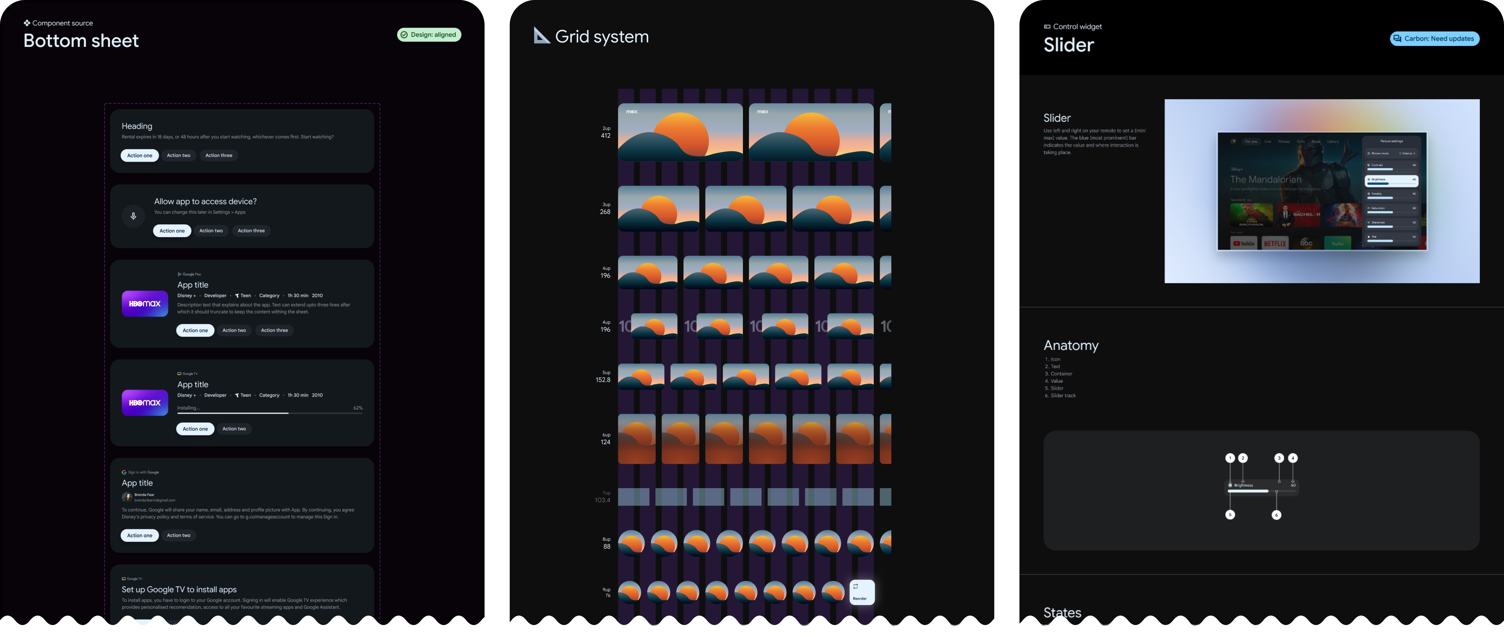
- Next, detailed sticker sheets were created for primitive components like buttons, text inputs, checkboxes, radio buttons, and switches.
- Following primitives, we designed more complex components including Dialogs, Bottom Sheets, Loaders, Time Pickers, and Cards.
- Guidelines for color extraction-based theming were also developed to ensure components could adapt visually to content.
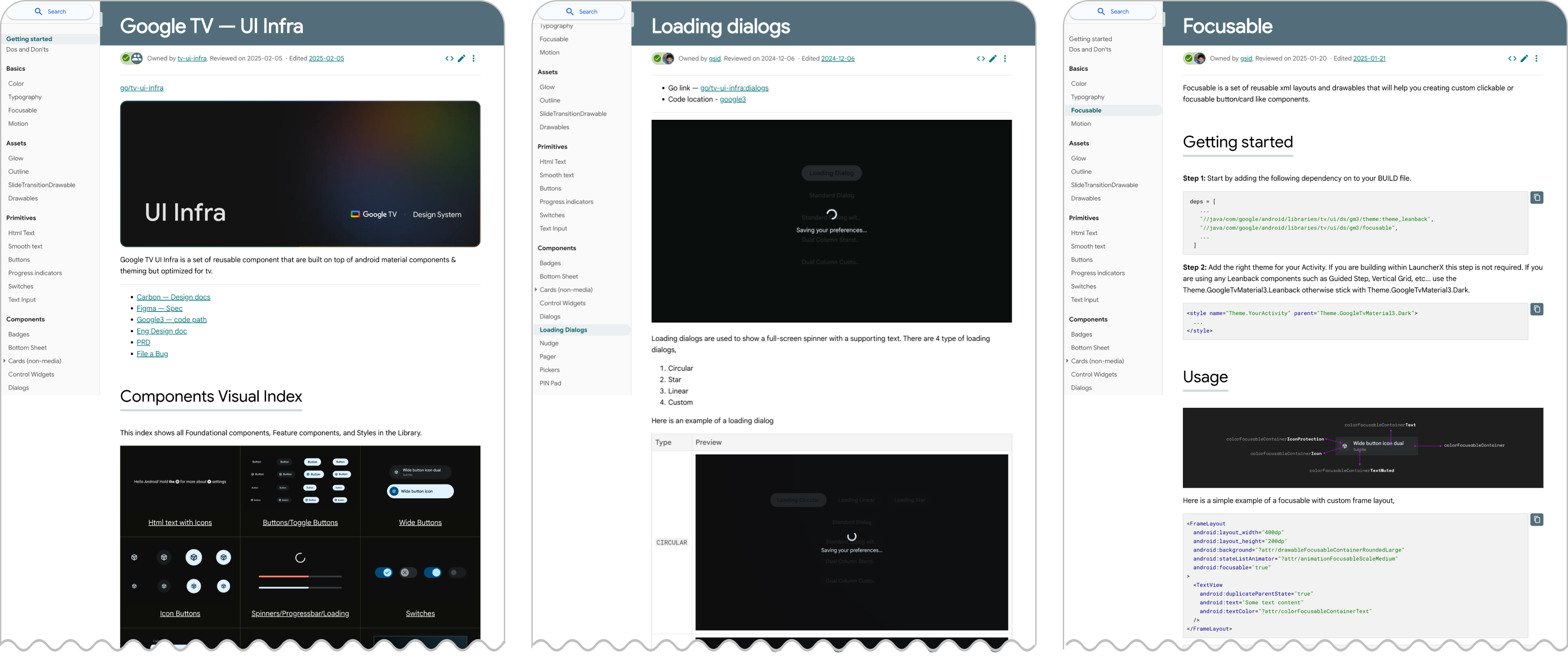
Developer Documentation Portal:
- Comprehensive developer documentation was created for every foundation element, primitive, and component developed.
- This central portal (go/tv-ui-infra) provides clear usage instructions, code samples, and visual examples (screenshots) for each component and its variations, enabling developers to integrate them confidently.
Catalog App:
- To facilitate hands-on exploration, we built a Catalog App accessible via a developer menu directly on TV OS test devices.
- This app hosts live, interactive samples of each component, allowing designers and developers to easily experiment and familiarize themselves with the TV UI Infra offerings.
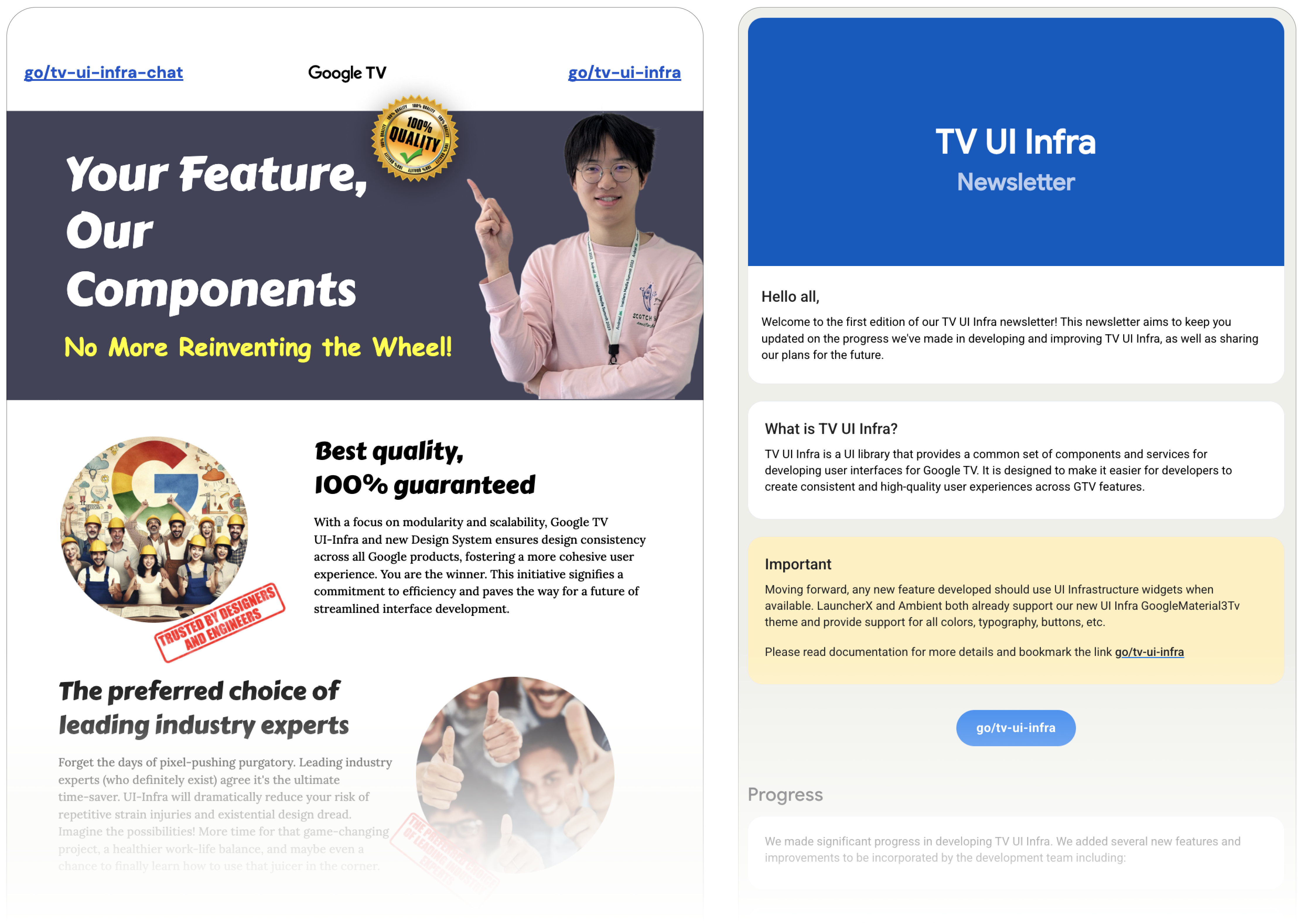
Evangelization and Adoption:
- Established a Governance Model with a dedicated UI Infra team managing sprints and prioritizing requests.
- Fostered adoption through clear documentation, regular newsletters, and demos to the wider TV team.
Results & Impact
TV UI Infra delivered significant improvements across multiple areas:
- Improved Performance: Switching to async fonts yielded major gains:
- 38.83% improvement (4s) in device boot cold start median.
- 4.15% improvement in Home button latency P95.
- 4.85% improvement (230ms) in normal cold start median.
- Increased Development Velocity: Teams could build features faster by reusing components (Target: 15% reduction in time to build features using the library).
- Enhanced UI Consistency & Quality: Ensured a cohesive look and feel across Google TV apps and partner experiences, improving user trust and brand perception.
- Reduced Duplication & Churn: Eliminated redundant work and simplified maintenance.
- Enabled Faster Experimentation: Allowed teams to experiment with UI changes (e.g., card layouts) more rapidly.
- Improved Partner & OEM Integration: Provided templates and standardized components to expedite partner development and customization (e.g., Setup, Bluetooth pairing).
- Strong Adoption: Achieved widespread use by TV and xPA engineering teams for new feature development.
Key Takeaways
- Foundational investment pays off — Investing in a robust design system and component library is crucial for scaling product development and maintaining quality.
- Cross-functional collaboration is key — Success required tight alignment between UX, Engineering, Product, and Program Management.
- Documentation and communication drive adoption — Making the library easy to understand and use, combined with proactive outreach, was essential for getting teams onboard.
- Balancing standardization with flexibility is critical — The system needed to provide consistency while still allowing teams the flexibility to innovate and meet specific product needs.