Google TV Design Systems
Amati (codename) Design System is Google's design system for media-focused TV interfaces. Built upon Material Design principles, it establishes a cohesive television experience that is cinematic, bold, and enjoyable.
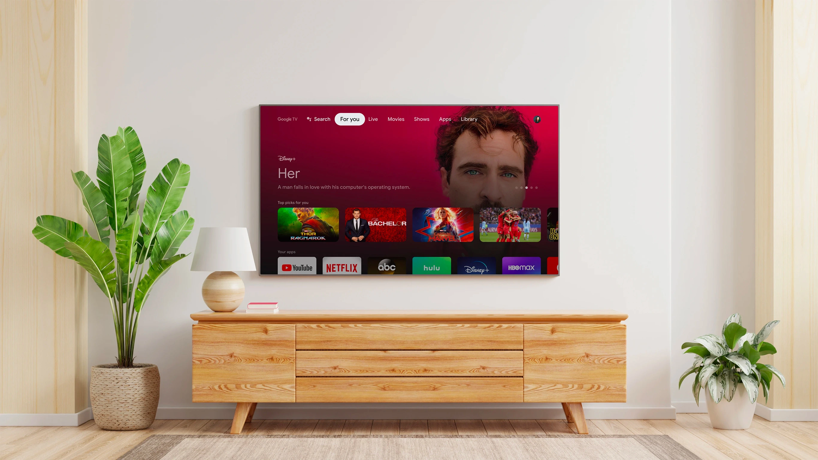
Designing for TVs
There are several factors that make designing for TVs unique:
- Remote Control Navigation: All interactions are controlled by a D-pad remote. This necessitates a clear, predictable focus, and all designs must be optimized for up, down, left, and right navigation.
- Viewing Distance: Users are typically 10 feet away from the screen, making scaling and density crucial considerations
- Shared Experience: TVs are often used by multiple people at once. Designs should be respectful of this communal nature.
Principles
Google TV Design System is the design system that shapes the Google TV experience on television screens, adhering to the following principles to create visually engaging experiences.
- Cinematic — Prioritize the content, evoking the grandeur of cinema and creating an immersive experience. Emphasize vibrant visuals over dense information. Allow lighting and ambiance to shift and enhance the content, drawing users into the narrative.
- Bold — The experience should be bold and confident, yet friendly, while remaining distinctly Google. Respect the TV's form factor, interaction methods, and typical placement within the home.
- Intentional — Maintain a clear and logical focus on each screen, minimizing distractions. Provide strong visual cues so users can easily reorient themselves. Consider the space the TV occupies and its primary input method (remote control).
- Accessible — Prioritize accessibility, as it benefits all users. Ensure the design adheres to Google's high standards for inclusivity.
Color
Google TV adheres to the Google Material TV color guidelines, utilizing content-forward techniques to generate a content-informed color palette, resulting in a highly immersive visual style.
For detailed information on the application of color in TV interfaces, please refer to the color guidelines outlined in Google Material TV.
Color principles
- Context-Driven Color — Prioritize a content-first experience by letting the context dictate color choices, resulting in a more immersive experience.
- Build from dark — Respect the typical viewing environment and screen size by building upon a dark foundation for a more user-friendly experience.
- Lighting Harmony — Ensure consistency by aligning colors, luminosity, and direction to craft cohesive and harmonious environments.
Color system
Google TV doesn't limit itself to the Google TV branded palette. It employs color strategically to craft an immersive visual experience, selecting colors dynamically based on the context.
- System — For system features like Settings, Notifications, and OOBE use Google TV branded colors
- Neutral — For exploratory features use neutral colors
- Content informed — For content details and in other applicable places use the color extracted from the key art.
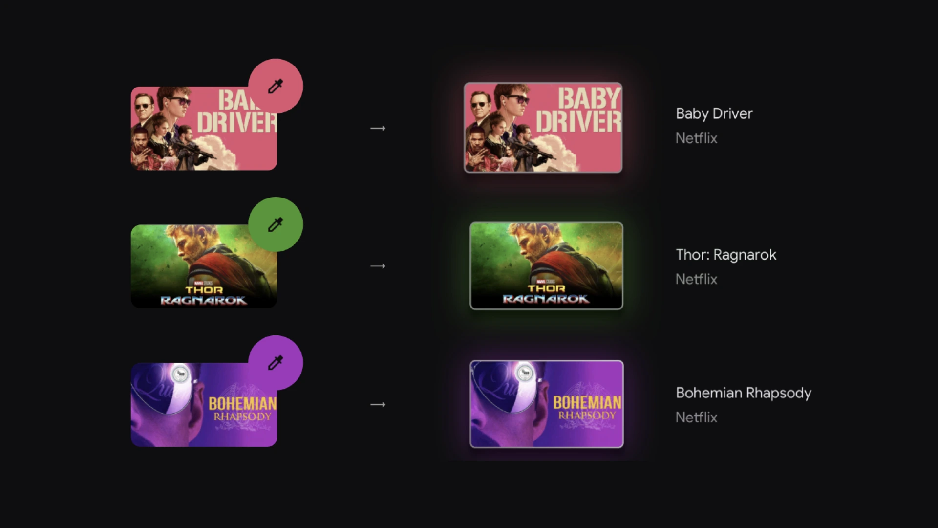
Extract colors from key art for content. Select a highlight color and adjust opacity to achieve the desired brightness and balance. Utilize a vibrant color from the extracted palette as a tint to enhance the visual experience.
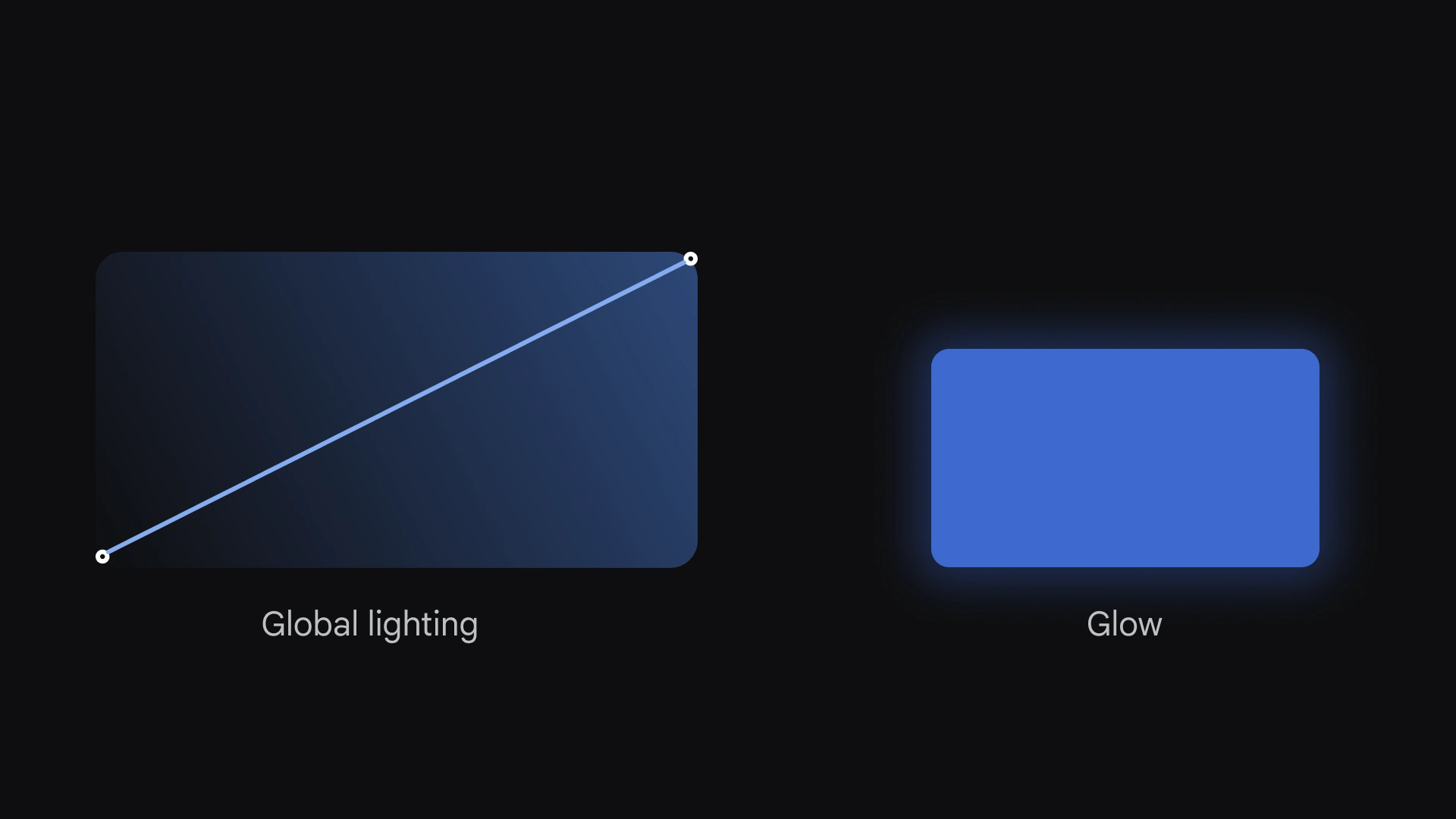
There are two main light sources:
Global — Global lighting emanates from the top-right of the screen. Some UI elements, such as art on cards, inherit this lighting.
Glow — Individual UI elements such as buttons and cards create a glow behind them. This light is cast onto the background though it exists below and drop-shadow for objects.
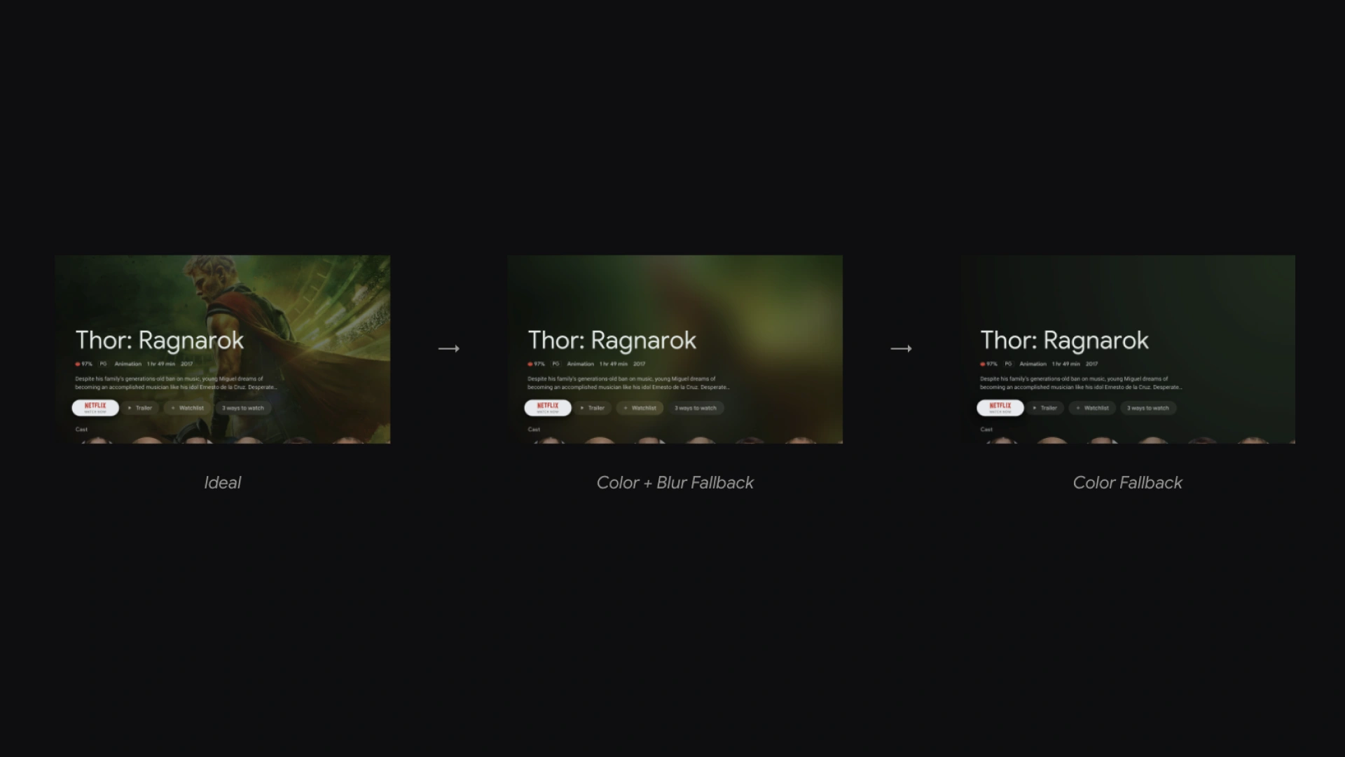
Google TV should be immersive as possible, regardless of assets. In the case of missing assets, we rely on a tiered system of color and blur to make the empty screen more visually interesting
Typography
Google TV follows the Google Material TV Typography guidelines, however, Google TV uses only a subset of type styles to create a consistent and cohesive experience.
Refer to the type guidelines in the Google Material TV Typography for in-depth details about the application of type on TV.
Principles
- Be bold — Use typography to celebrate moments of Google smarts, such as recommended content or a curated cluster.
- Be expressive — Utilize Google’s typefaces to help carry brand energy throughout an experience that otherwise gives media content the spotlight.
- Be consistent but not restrictive — Google TV's type system contains a variety of sizes and weights to support any piece of content or product need.
Typefaces
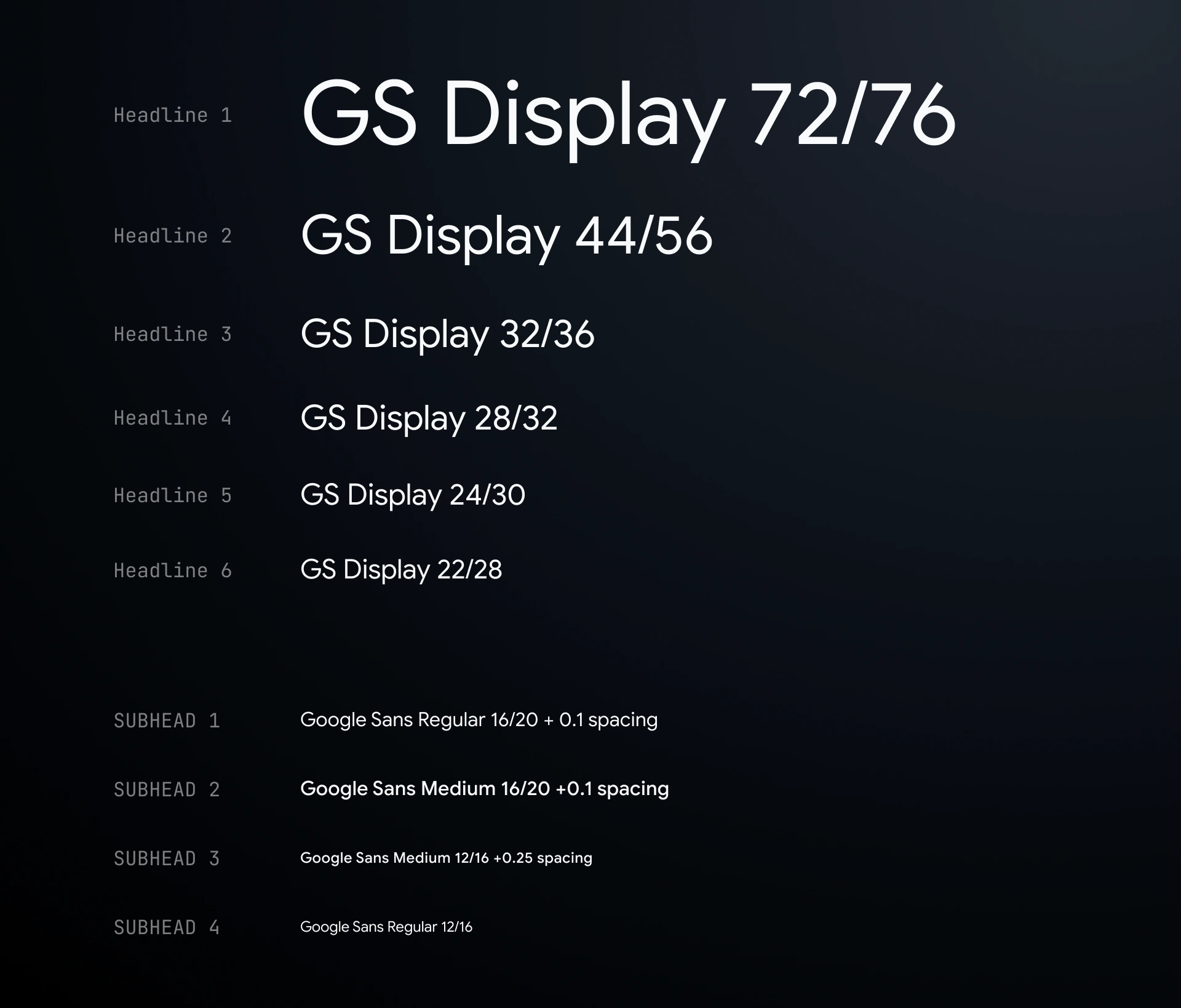
Google Sans has round, geometric letter forms designed to echo the Google logo. Use it for Google-branded text across all platforms. Google Sans comes in three weights: Regular, Medium, and Bold. Although localization is an ongoing priority, Google Sans only covers Latin-extended, Greek, and Cyrillic languages at this time.
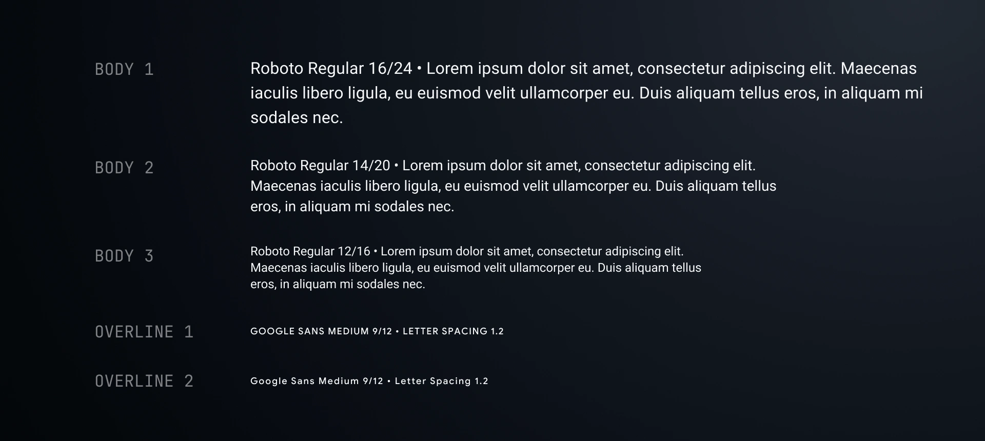
Android has its own system typeface Roboto — optimized for legibility and clarity on its respective platforms. Use Roboto for any utilitarian, non-branded text that's best served by a native platform experience.
Layout
Google TV follows the Google Material TV layout guidelines, it also takes advantage of the content-forward experience to generate an immersive layout.
Refer to the layout guidelines in the Google Material TV for in-depth details about creating layouts for TV.
Principles
- Emphasize the content — The experience should feel immersive and get out of the way of the media content.
- Keep it open and airy — Avoid heavy density, as a grouping of television content can potentially become visually busy. The right spacing can help organize and create a sense of calm.
- Stick to the grid — Our layouts are built off of the Material 4dp grid but optimized for a 10-foot viewing experience and D-pad input.

Global margins balance the UI and protect critical information from potential overscan issues. The left and right margins are set at 48dp, and the top and bottom margins are set at 27dp.
5% of 960 = 48dp
5% of 540 = 27dp

Our layouts employ a 12-column grid with 4dp baseline vertical spacing. The grid is built using twelve 52dp columns and 20dp gutters.
Components
I have also documented all the components in Figma for the teams to re-use.
Buttons

Lists

Cards
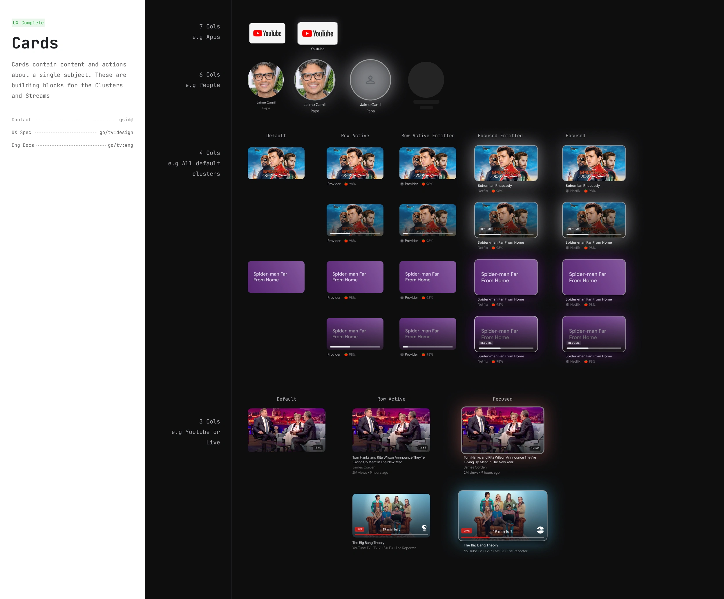
and more...
Figma Plugins
I also developed several Figma plugins to help the team expedite the design process and incorporate real production data.
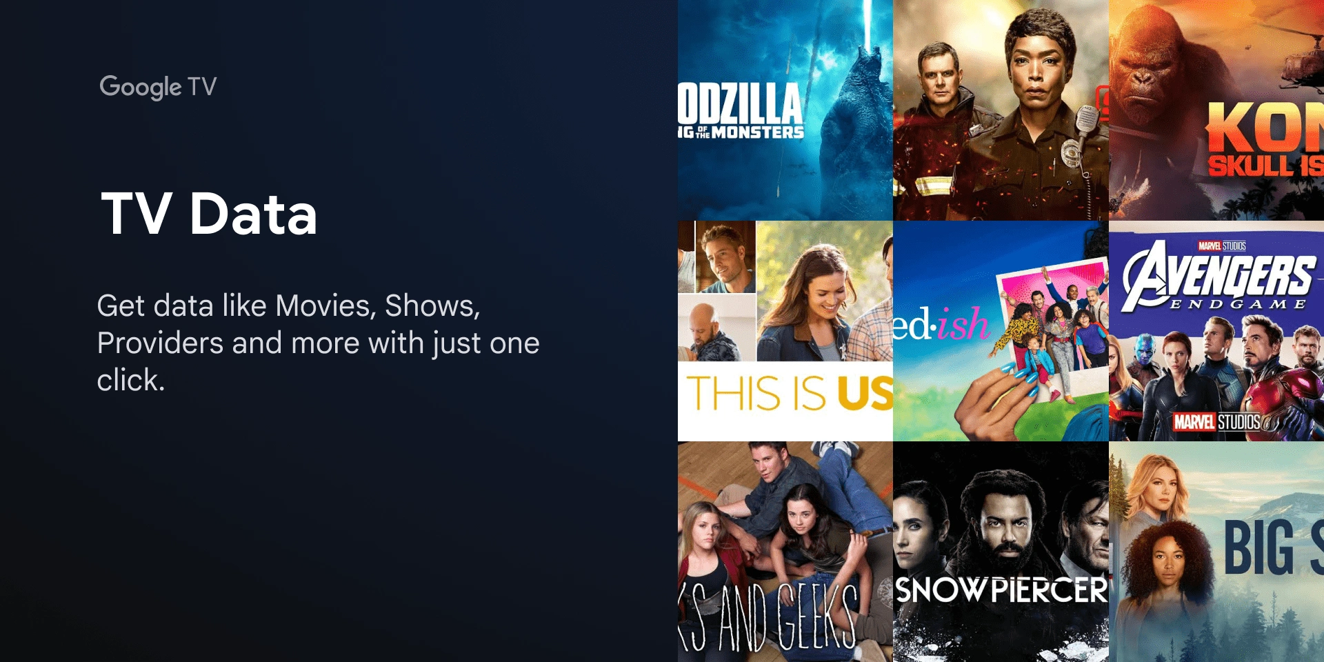
A Figma plugin that quickly generates mock data for your designs, generating data like Movies, Shows, Providers, and more with a single click.
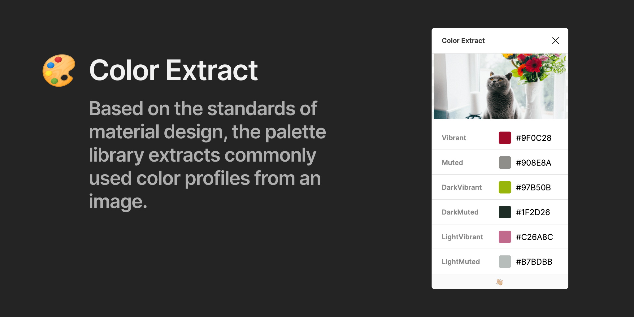
Adhering to material design standards, the palette library dynamically extracts commonly used color profiles from images. The palette library attempts to extract the following six color profiles: Light Vibrant, Vibrant, Dark Vibrant, Light Muted, Muted, and Dark Muted.
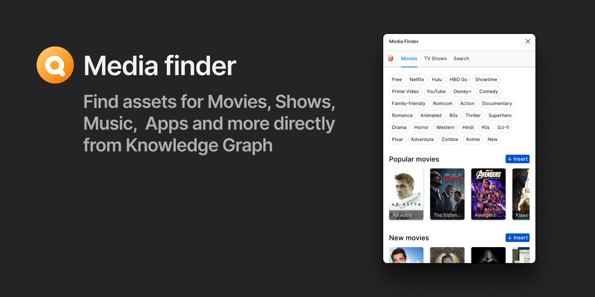
Media finder is a tool/plugin that helps teams to find and entities like Movies, TV Shows, People, Music, Apps and much more.
Team training
A design system achieves success when designers readily adopt and effectively utilize it. To facilitate this, I led training sessions to introduce the design system setup to various cross-PA teams (including TV, Duo, Nest, Stadia, and Identity). These sessions covered how to use the design library and its supporting plugins.


Impact
Over the past couple of years, I have owned and maintained the Google TV design systems. Designing for TV presents unique challenges and limitations, which I've navigated to create successful solutions. During this process, I have acquired a deep understanding of designing for TV and documented best practices. I hired a designer to continue making improvements to our system. The TV Design Library has also served as an inspiration for other teams, such as Android Sys UI and Assistant on TV, demonstrating its broader influence within Google.