Connect Sales
During this six-month-long project, I worked directly with senior leadership and six different product managers to envision a next-generation CRM tailored for Google's vast, organically grown, and notoriously complex management chain.
About the Sales Platform & Our Users
Before diving in, let's set the stage with a quick primer on Google's sales ecosystem.
Team
- Customer Engagement — Responsible for Google's suite of customer-facing products, including Google Support and Google Ads lifecycle tools.
- Sales Platform — Develops tools for Google's business organization, supporting the multi-billion-dollar Ads business.
- Connect Sales (a.k.a. Greentea) — An ad sales intelligence platform focused on customer success, sales productivity, and keeping sales teams happy (or at least less stressed).
Users
- Google Business Organization (GBO) — The 20,000+ Ads sellers at Google, spanning large accounts, small businesses, agencies, and publishers.
Glossary: A Quick Sales Jargon Cheat Sheet
- Seller or Frontline Sellers — Googlers in the GBO organization selling Google Ads products. (Think: Account Managers, Account Executives.)
- Client, Company, or Customer — External businesses spending money to run ads on Google platforms. (e.g., Disney, Best Buy, Expedia.)
- LCS — Handles Google's biggest clients. (Think: Amazon, Booking.com.)
- GCS or Scaled — Focuses on smaller and long-tail customers, often remotely. (e.g., University of North Texas, Ducati.)
- GBO — Google's sales and marketing powerhouse.
Background: A CRM Built for Scale, but Not for Everyone
Greentea was initially built with frontline sellers in mind, achieving a solid 70% CSAT (Customer Satisfaction Score).
But managers? Not so much. Their CSAT sat at a sad 55%, meaning there was significant room for improvement.
Managers needed a tool that worked for their specific needs—tracking performance, analyzing trends, and making data-driven decisions—without spending hours sifting through outdated reports.
The Pain Points: What's Broken?
- No high-level visibility — Managers had to manually track their entire book of business.
- Outdated reporting — They relied on static reports or decks updated weekly, making real-time decisions impossible.
- Lack of a single source of truth — Sales leaders needed a consolidated view of both LCS and GCS, which didn't exist.

The Goal: A Smarter, Future-Proof CRM
We set out to build a personalized CRM designed to last 10+ years and serve all levels of Google's sales management chain.
What success looks like:
- Give leadership a bird's-eye view of their entire book of business.
- Help managers instantly identify areas that need attention.
- Enable deeper analysis at every level of the organization.
Project Structure: Divide & Conquer
Since we were reimagining the entire experience, we divided the work into specialized tracks:
- UX Infrastructure — Built scalable components like the Role Picker and Territory Switcher.
- Overview — A visual summary that highlights weak areas in the business.
- Portfolio — A deep dive into all key sales metrics.
- Pipeline — An aggregated view of the sales pipeline, forecasting revenue flows.
- Reporting — A self-serve reporting tool that pulls data across different metrics.
- People — A way for managers to track team performance.
Research: Building with Real Users
To make sure we were solving real problems, we used a hands-on research approach:
- Weekly sessions with an Advisory Board — A group of managers worldwide provided ongoing feedback.
- In-person interviews — We sat down with managers to understand their pain points.
- F.A.S.T. Methodology — We used the Focus, Attend, Summarize, Translate (FAST) approach to quickly iterate on designs.
Our Design Principles
- Incorporate momentum — Managers require the ability to track the progression of key business metrics over time. The trajectory is needed both to contextualize and evaluate the impact of coaching and interventions.
- Highlight softness in the business — When a key business metric is underperforming, support managers in localizing drivers by territory and product.
- Intuitive guided interpretation — Be sensitive to the complexity of having a wide variety of data/metrics available on a single view. Aid users via logical organization and grouping of cards. Provide cues on how card groupings relate to business use cases.
- Highlights and lowlights, not lists — Utilize an overview to capture the top drivers for a given use case/question. This is not appropriate for displaying complete lists of entities.
- Multiple levels of progressive disclosure — Employ hover interactions to further contextualize data visualizations. A deep link pattern supports navigation to entity summary and detail pages.
- Unfettered access to your territory — Provide managers with a complete view of what they're responsible for. Incorporate navigation patterns that support quick navigation through the territory hierarchy.
Design Criteria: Guardrails for Success
Based on the high-level principles we distilled, we compiled a specific list of guardrails:
- Focus on “toothbrush” use cases — Features should be used daily, not just for quarterly reports.
- Borrow from existing design language — Ensure consistency with Google's other internal tools.
- Simplify complex data — Prioritize visualizations over raw tables.
- Fast insights — Users should get a 3–5 minute overview, not a 30-minute deep dive.
- Highlight trends — Use color and movement to indicate soft spots in the business.
- Recursive design — Users should be able to drill down seamlessly.
Toothbrush Tasks: What Managers Need to Know Daily
Target
- How does performance look across my territory?
- How am I pacing toward my revenue target?
- How am I pacing toward product metric targets?
In-Quarter Pacing
- How is revenue tracking through the quarter?
- How is outlook tracking through the quarter?
Gap to Target
- Where are the largest gaps in my territory?
- Which teams are contributing the most to the gap?
- Which companies are contributing the most to the gap?
Weekly Performance Change
- Which teams are driving weekly performance changes?
- Which companies are driving weekly performance changes?
Pipeline
- Do we have enough pipeline?
- How is the pipeline progressing?
Sales Rigor
- How am I pacing toward sales activity targets?
Design Showcase: The Final Product
Each feature was designed to answer critical questions at a glance.
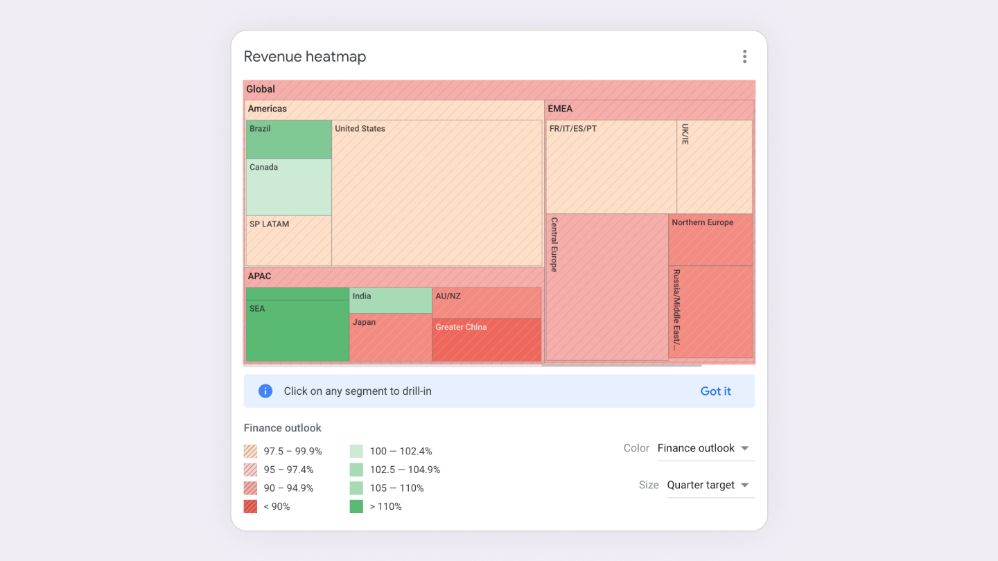
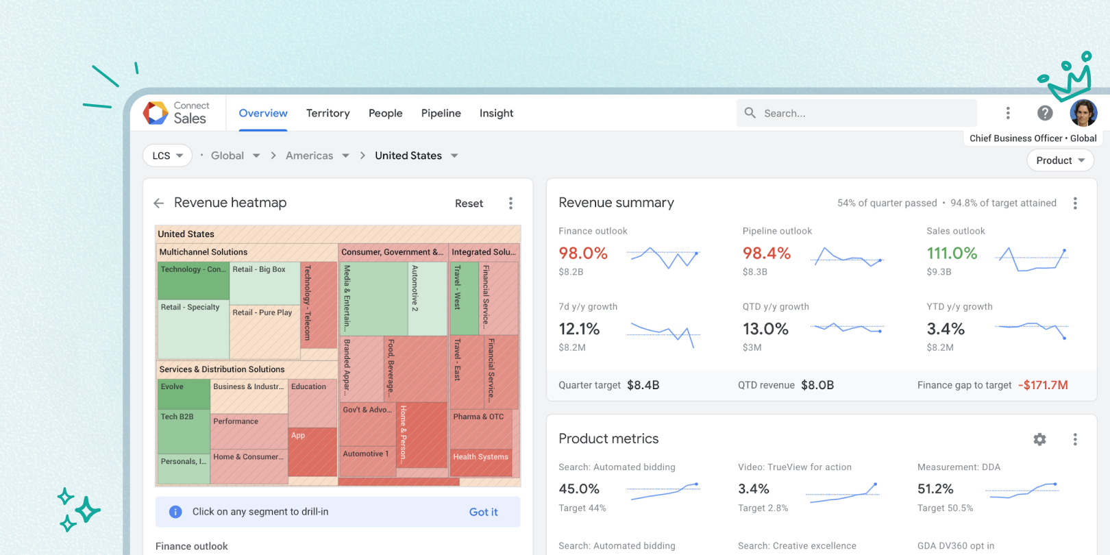
🧐 Where are my strongest & weakest performers?
At a glance, I can identify the lowest/highest performers by a metric of interest (showing Finance outlook) and determine if softness is localized or distributed across many nodes. The heat map provides contextual navigation allowing managers to drill into nodes of interest.
The tooltip shows information about the hovered segment. The tooltip persists when the user moves the cursor over it, supporting highlighting and copying of data.
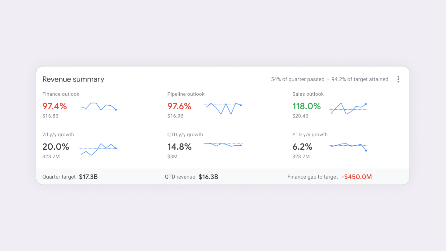
📊 How am I pacing toward my revenue target?
As a manager, I can see a snapshot of attainment toward the target, outlook projections, and growth rates. Trend lines add a dimension of momentum, allowing me to see how metrics are progressing through the quarter.
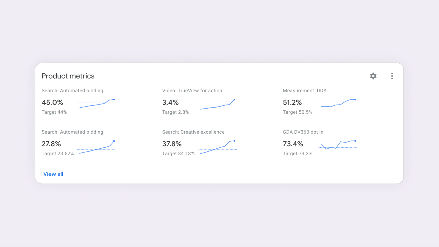
How am I pacing toward my product metric targets?
As a manager, I can see a snapshot of attainment toward targets plus progression through the quarter. As with the current overview product metric card, the specific metrics shown can be customized by the user.
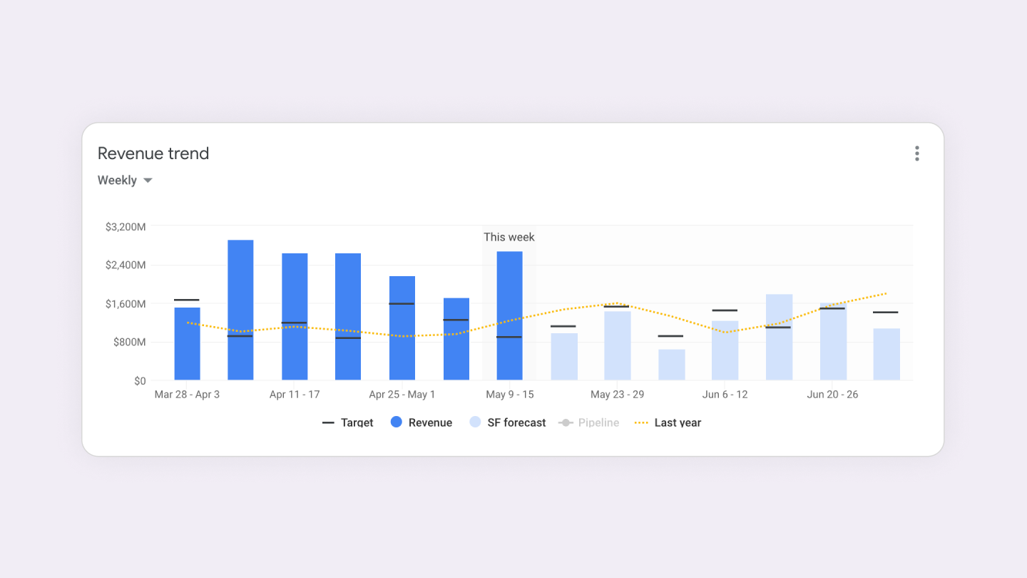
How is revenue tracking through the quarter?
As a manager, I can get a weekly pulse of revenue attainment. The inclusion of last year's values provides additional data points to contextualize performance/growth. (e.g., Date range: Current quarter; Granularity: weekly or daily.)
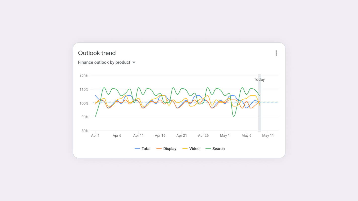
How is outlook tracking through the quarter?
As a manager, I can evaluate pacing toward product-level targets (search, display, video). Daily values contextualize momentum through the quarter.
By using the card controls, I can switch to a view that lets me triangulate, comparing the three outlook metrics. As we progress through the quarter, I expect and look for alignment between the metrics.
Time range: Current quarter; Each data point represents one day.
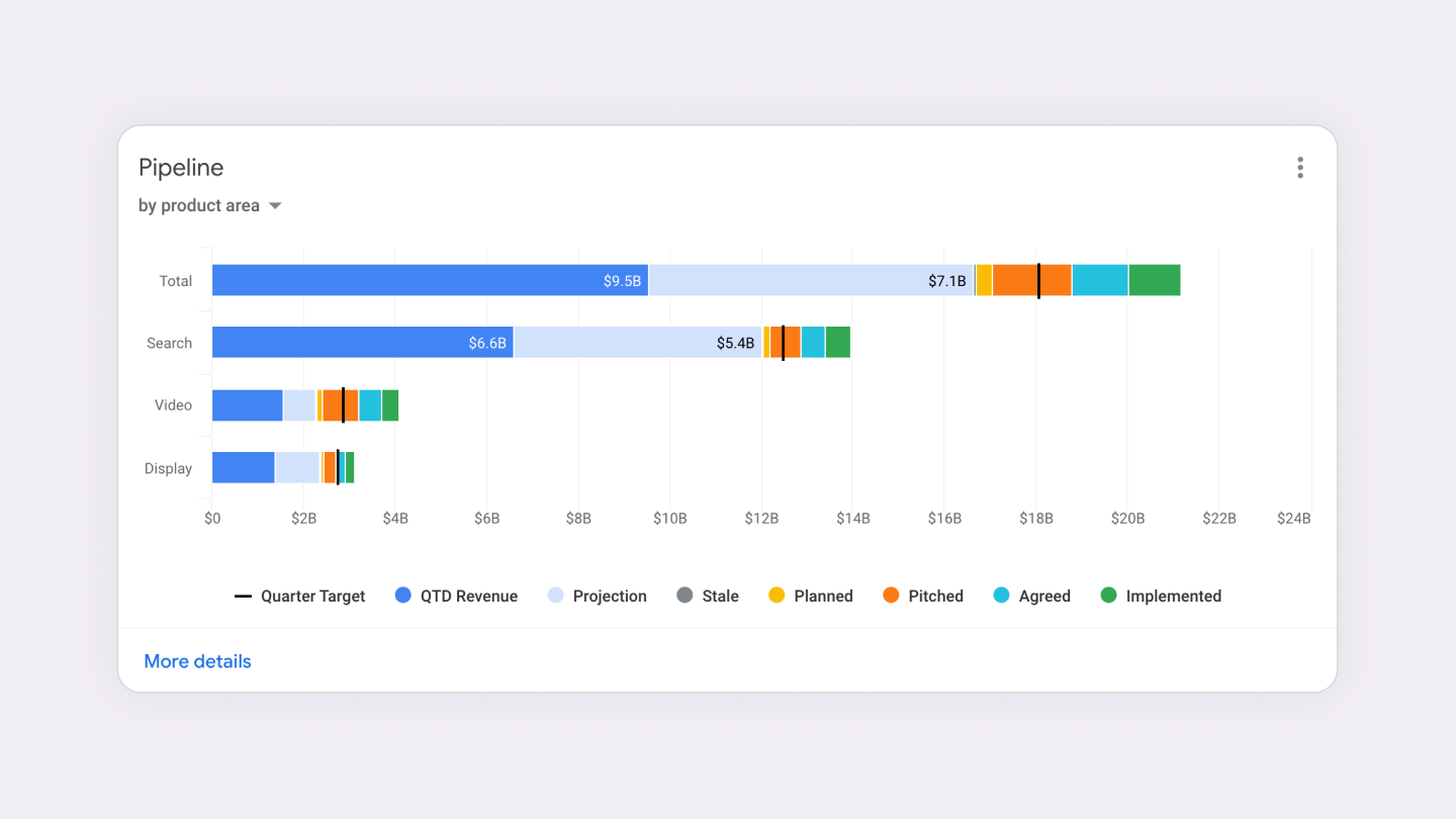
Do we have enough pipeline?
As a manager, I can validate that the pipeline has been sufficiently built to meet the target. A breakout by stage enables me to understand the contribution of ASO vs. new incremental revenue.
Default: Breakdown by N-1. (Clicking on each N-1 row navigates to that level and breaks down the pipeline further to N-2.)
Drop-down option: Breakdown by products.
Final Thoughts
With Connect Sales (a.k.a. Greentea), Google's sales leadership now has a scalable, intuitive CRM built to handle decades of growth.
Managers get real-time insights, better decision-making tools, and less time wasted on outdated reports—all in an experience designed to scale with Google's sales teams for years to come.
Now, if only we could get our personal inboxes as organized as this CRM.