Designing for color blindness
One of the most common questions asked in making a site accessible is How do I design for colorblind users? First off, before designing for colorblindness we have to understand what is how our eye works and what the reason causing colorblindness is. Let's jump right in,
Color blindness is not "color blindness"!
There are still a lot of people who think that if you are colorblind you really can't see any colors. But the term is misleading, as more than 99% of all colorblind people can see colors. A better wording would be color vision deficiency, which describes this visual disorder more precisely.
So what actually is color vision deficiency? In simpler words, if you are suffering from a color vision deficiency you perceive a narrower color spectrum compared to somebody with normal color vision.
Color perception builds up by three different types of cones. Each type is sensitive to a certain wavelength of light (red, green, blue). Every perceived color is therefore a mixture of stimuli of those three cone types.
So why is this important? Approximately 8% of all men and 0.5% of all women worldwide are affected by color vision deficiency.
Understanding vision deficiency
Let's look at the human eye and understand what it is constructed of, we all know the retina is responsible for our vision and the retina is built with a number of atomic cells called cones and rods. Cone cells, or cones, are photoreceptor cells in the retinas of vertebrate eyes that will they respond differently to light of different wavelengths, and are thus responsible for color vision and function best in relatively bright light, as opposed to rod cells, which are responsible for seeing in dim light.
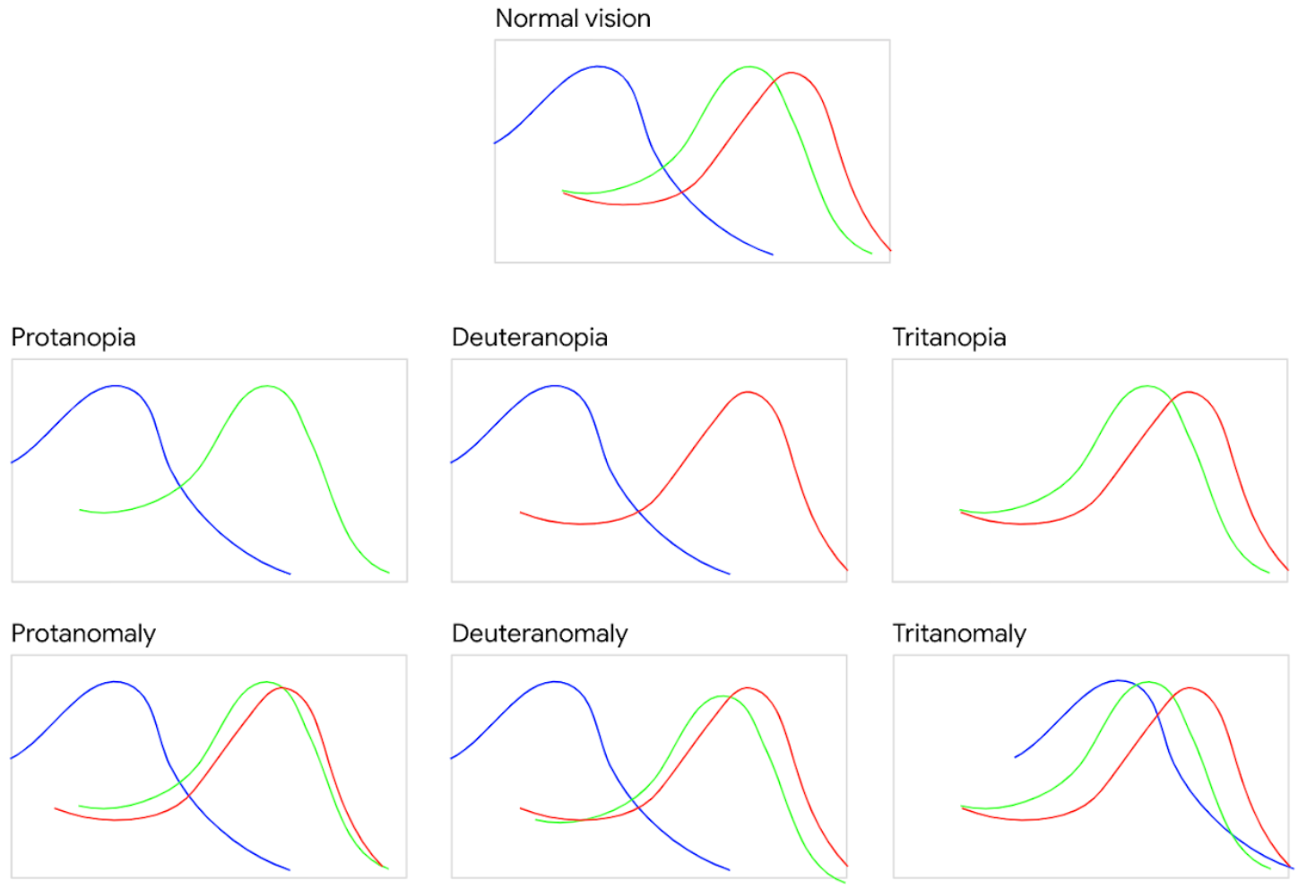
Cones contain one of three different photopigments. This makes cones sensitive to long (red), medium (green), or short (blue) wavelengths of light. The presence of three types of photopigments, each sensitive to a different part of the visual spectrum, is what gives us our rich color vision. Humans are unusual among mammals for our trichromatic vision — named for the three different types of photopigments we have. Here are the three types of cones responsive to different wavelengths,

- S-cones: sensitive to short wavelength light with a peak at ca. 420nm • Blue (tritan)
- M-cones: sensitive to medium wavelength light, peak at ca. 530nm • Green (detuan)
- L-cones: sensitive to long wavelength light with a peak at ca. 560nm • Red (protan)
So when one or more types of these cones are missing/defective vision deficiency occurs and one can see fewer or no colors. There are 3 types of vision deficiency,
Monochromatism Either no cones available or just one type of them.
Dichromatism (Anopia) Only two different cone types. The third one is missing completely.
Anomalous trichromatism (Anomaly) All three types exist but with shifted peaks of sensitivity for one of them, which results in a smaller color spectrum.
Based on the cone type missing or defective, there are many types of colorblindness, for e.g, if a person is missing (anopia) red cones (protan) its called Proto-anopia, if they have malfunctioned (anomaly) red cones(protan) its called Proto-anomaly, similar for all the other 2 cone types.
And below image shows how different wavelengths are missing or disoriented from the normal cone curves,
here is what different colorblind people see from the original colors,
Not all colorblindness is common, the share of different types of colorblind humans worldwide and it looks like below,
1. Anopia (Missing Cone Type)
- Protanopia (Red missing):
- Men: 1.01%
- Women: 0.02%
- Deuteranopia (Green missing):
- Men: 1.27%
- Women: 0.01%
- Tritanopia (Blue missing):
- Both sexes: 0.0001%
2. Anomaly (Malfunctioning Cone Type)
- Protanomaly (Red weak):
- Men: 1.08%
- Women: 0.03%
- Deuteranomaly (Green weak):
- Men: 4.63%
- Women: 0.36%
- Tritanomaly (Blue weak):
- Both sexes: 0.0002%
3. Monochromacy (Achromatopsia — Total Color Blindness)
- Both sexes: 0.00003%
How do I Design?
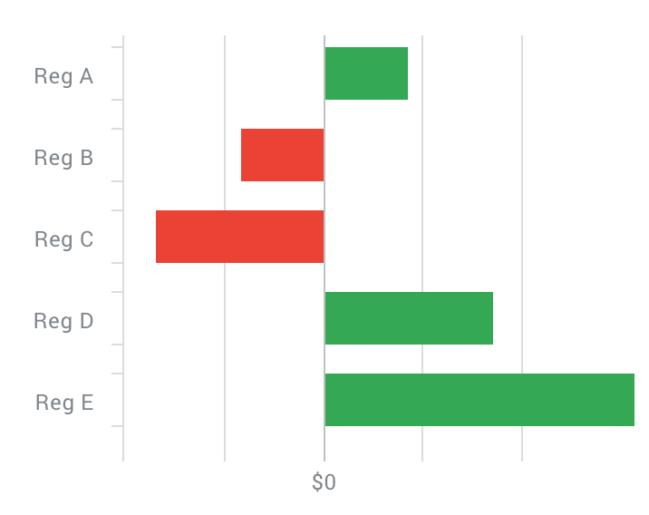
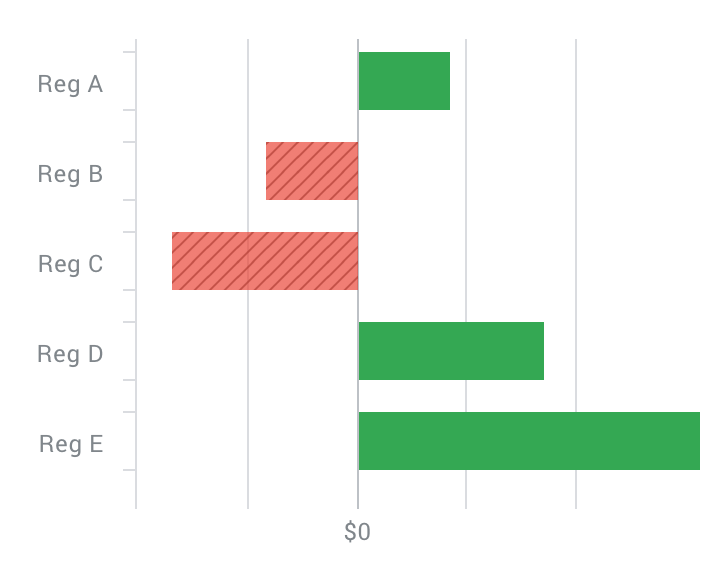
Designing for red/green
- Don't just rely on color to differentiate between data.
- Use some kind of additional indicator to show the difference. E.g Icon, +ve -ve signs, fill patterns
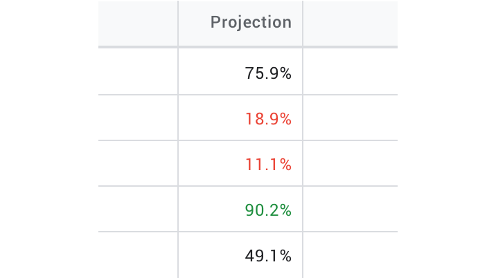
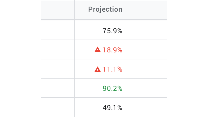
When using conditional formatting in tables don't just rely on red & green, add an additional indicator like the icon here shown below.
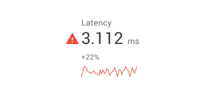
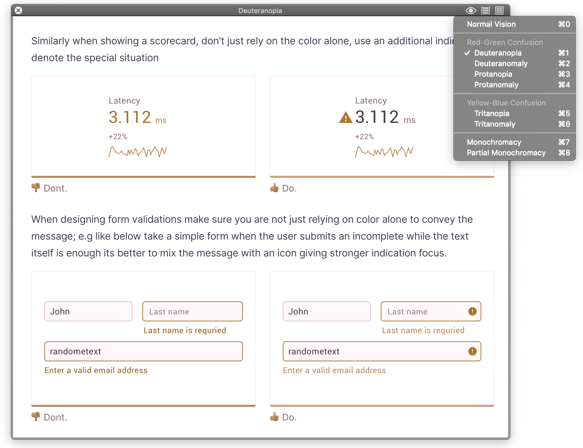
Similarly when showing a scorecard, don't just rely on the color alone, use an additional indicator to denote the special situation
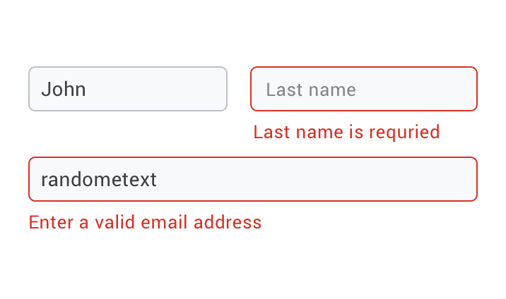
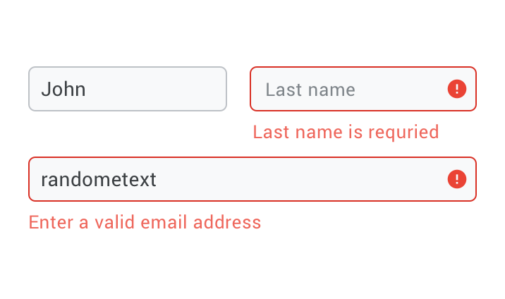
When designing form validations make sure you are not just relying on color alone to convey the message; e.g like below take a simple form when the user submits an incomplete while the text itself is enough it's better to mix the message with an icon giving stronger indication focus.
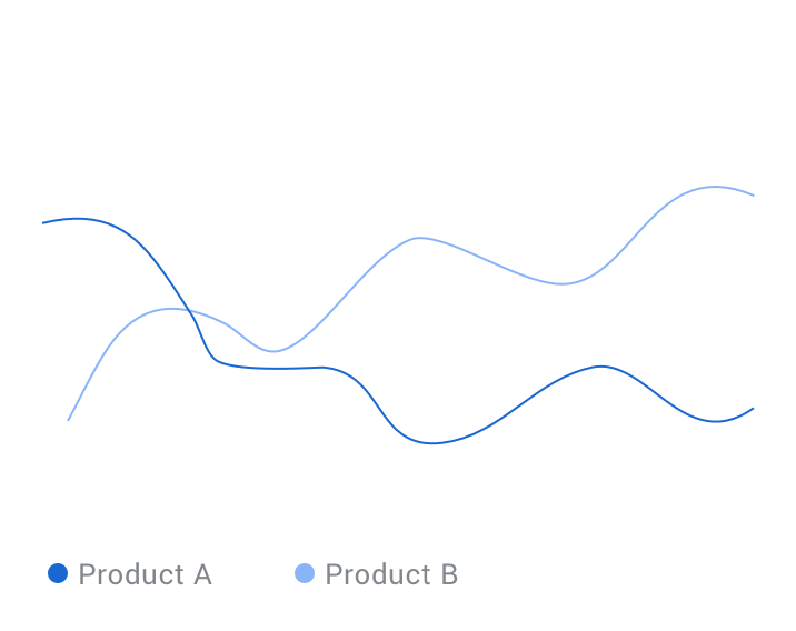
Designing color-blind-friendly charts
Leverage dark and light when necessary
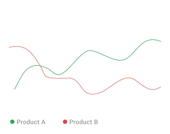
Sometimes your chart design will require a combination that is considered unsuitable for those who are color blind. In cases where you must use combinations like red and green, it's highly recommended that you leverage a dark vs. light combination.
Alternatives for distinguishing information.
Think of alternatives to color, like fill patterns and symbols to indicate different colors.
also, try to avoid bad color combos
- Green & Red
- Green & Brown
- Blue & Purple
- Green & Blue
- Light Green & Yellow
- Blue & Grey
- Green & Grey
- Green & Black
Use a colorblind-friendly color palette
By using a colorblind-safe color palette, you are making sure that everyone can capture the differences and meanings of the information presented in the chart, as well as easily remember things you have put focus on.
The following are some colorblind-safe color palette
To learn more visit https://colorbrewer2.org
Label information when necessary
Clearly label the information when necessary, this helps to avoid confusion.
Provide a fallback
If any of the above steps won't optimize the graph, then provide a fallback of the data in a tabular or readable format. As shown below, the chart provides an option to toggle to the raw data view.
What software should I use?
It is important that we test our designs beforehand, but there might not be always a colorblind person accessible to help you in testing your designs. Thanks to technology, there is some software that can simulate different type of colorblindness, the best one out of all is Sim Daltonism, a tiny MacOS-only app that let's check your designs and websites with ease. There is other software but I recommend using Sim Daltonism.
- Sim Daltonism
- Alternatives
References
- Color-Blind-Essentials by Daniel
- Web Design for Color Blind Persons
- Color blindness: how to design an accessible user interface
- Color Blindness Simulator
- Using color blind simulator
If you like the post or have a suggestion? Please leave a comment below and also don't forget to follow me on twitter @websiddu